UX on UX Magazine website sucks
著
Why? A picture is worth a thousand words:
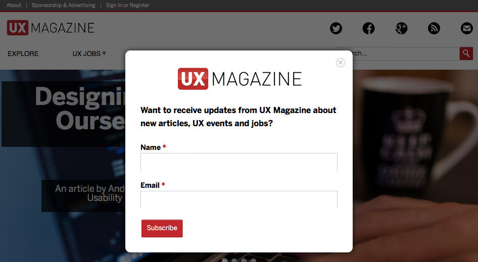
But hey, I'm an accessibility/usability guy and I can explain the reason shortly. UX Magazine forces first-time visitor to see dialog to subscribe his/her name and email address to receive updates of the website, no matter he/she uses PC or mobile. While the dialog and its dark background overlay whole page, he/she can't access to the content, the dialog is controlled by cookie so that frequent visitors don't have to get mad every time they visit though.
This kind of design pattern makes me mad enough, and in this case, I get doubtful why "UX" Magazine provides such a bad, irritating UX, ironically. It doesn't seem professional work, at least to me.

 @kazuhitoは、木達一仁の個人サイトです。主に宇宙開発や人力飛行機、Webデザイン全般に興味があります。Apple製品と麺類とコーヒーが好きです。南極には何度でも行きたい。アクセシビリティおじさんとしてのスローガンは「Webアクセシビリティ・ファースト」。